Verified Purchaser badge

Verified purchaser

Member since: Sep 2022Deals bought: 46
5 stars
5 stars
Posted: Aug 21, 2023

Linktree killer!

Linke is the best bio page app I’ve used through AppSumo. It goes beyond all the essentials needed to create great looking and great functioning bio pages. As it stands now it's a Linktree killer!

I’m planning on offering this as a free bonus service to my clients and also to my fellow music producers who currently use Linktree.

I really like the secret editor link with regeneration. (This is great for non-techy people to use and easy on admins.)

The interface is clean and easy to work with. The things that you can adjust and tweak are great! Most bio link page apps look boring and dated.

Could be better: (All minor gripes, no tacos crushed.)

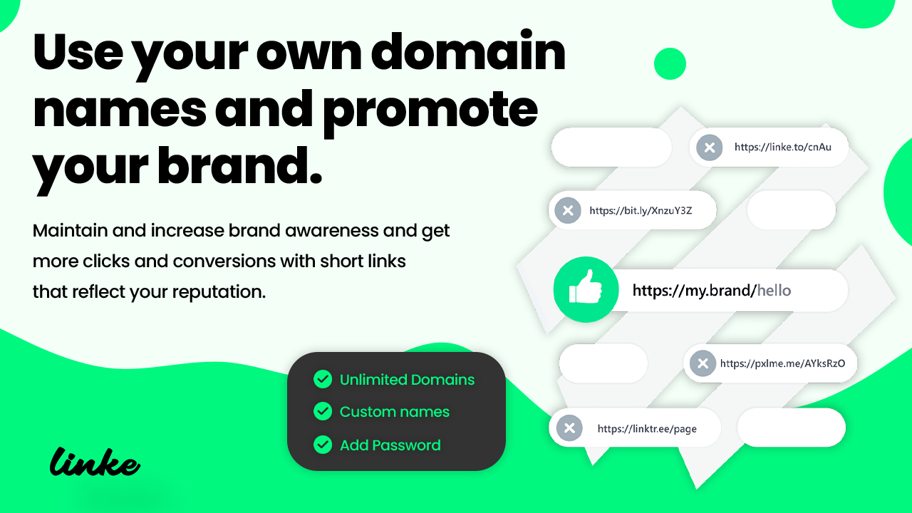
1. White label - It technically is. But if I want to provide it to people I don’t host, I must give them domain.linke.to for CNAME. If we could link to a non-Linke branded domain for CNAME that would solve this.

2. vCard - I can't figure out how to make the vCard phone number format correctly because it makes us add +1. We don’t normally do this in the USA, so when it auto creates the vCard, the formatting is off. Also all the links are the shortened links in the vCard. I understand why it's this way, but for vCards people want the factual information.

Please make a Manual vCard creator block to populate the fields. The auto creator is nice in theory but in execution it will never work better then manually adding the info, since all contact info doesn’t follow a particular format. Unfortunately vCard is not useful in its current form to me, so I’m forced to hide it entirely.

3. QR code link - It would be great to have an option to "show QR icon" (3 dots) on the top right of the bio page. When clicked, it would display the large custom QR code square as a popup overlay. Then X out of it when done.

This would be very useful for people that do face to face promotion. The person can scan the code and be instantly connected to the bio page.

4. Description Section - The description is the second level sub heading, so it makes more sense to have it as an <H2> tag instead of <p> or simply add the option to make it an <H2> with a checkbox. Also the ability to change the size would be nice.

5. Paragraph Block - I would appreciate more text formatting options to make this text block more versatile. It would be helpful to use it to add some small footer text at the very bottom with a link back to my website.

6. Blue Checkmark - I know we can turn it off. But what is it even for? It's like giving myself a trophy for something I made up. I had to mention this just because I’m stumped by it. :)

Founder Team
Nass-Linke

Nass-Linke

May 9, 2024

Hi there,

Thank you for your feedback, we are pleased that you appreciate the service, and we have taken note of your expectations for our future updates.

And some of them will be included in our September update, such as the sharing box on the bio page, including the QR code etc...

Regards

Helpful?
Share
Ratings