Superdense
Organize all your bookmarks across every browser using one homepage


Sifting through multiple browsers to find the right link can waste more time than mining the web for a specific URL. ("It's on the tip of my tongue—I mean the top of my search history.")
These digital shortcuts aren’t convenient when all your favorite pages and tools are lost in cluttered bookmark bars, never to be seen again.
If only there was a tool that let you fit all the bookmarks you want on one compact page that syncs across browsers and devices.
Introducing Superdense.
TL;DR
At-a-glance
Overview
Superdense is a bookmark manager that organizes your favorite links on one compact, personalized homepage.
With Superdense, you can access bookmarks across any browser and device using one personalized homepage.
You can easily organize bookmarks into custom categories and drag-and-drop them anywhere on your page.
Plus, this tool loads favicons instead of text, which means you have way more space to display your bookmarks.
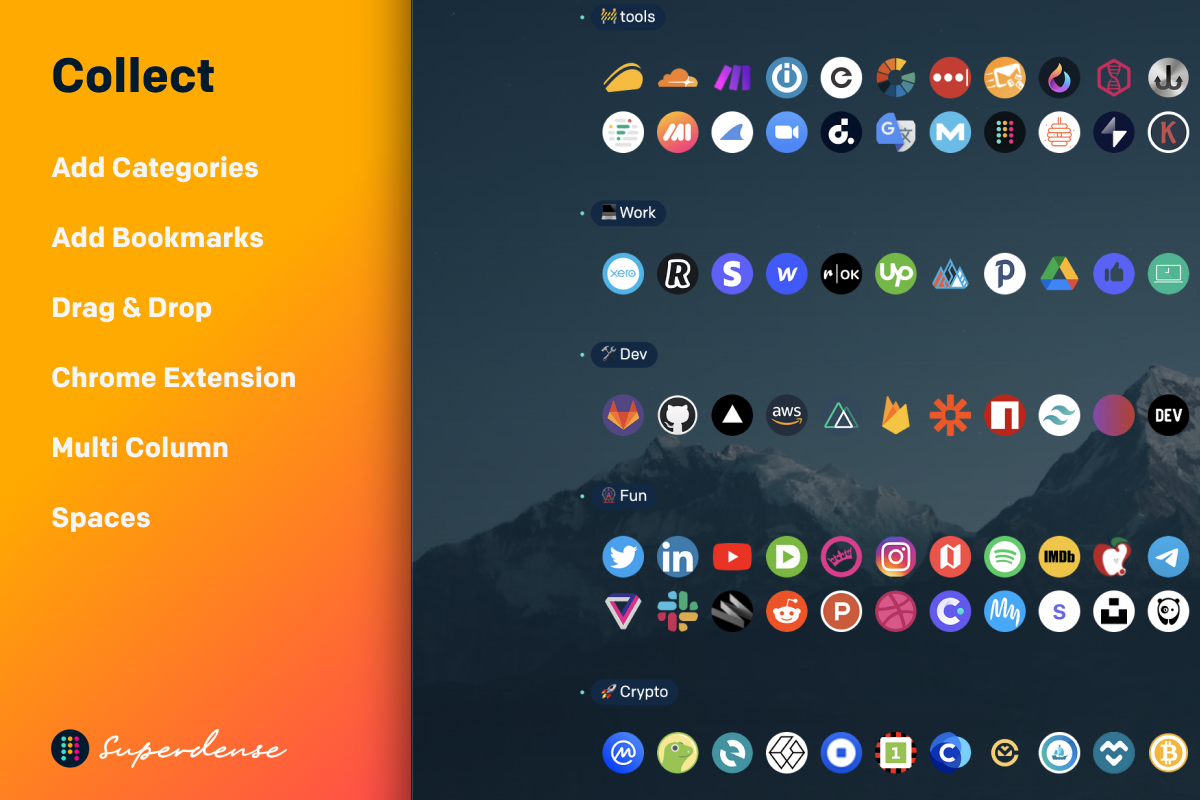
Keep your bookmarks organized in custom groups using your new Superdense homepage.
You can personalize your bookmarks homepage with custom designs, icons, images, and even a custom domain.
Superdense also offers a white-label option, so you'll be able to showcase your branding and add your own logo.
Plus, you aren't limited to use the default favicons or Superdense’s placeholder icons! Get creative and easily upload your own favicons.
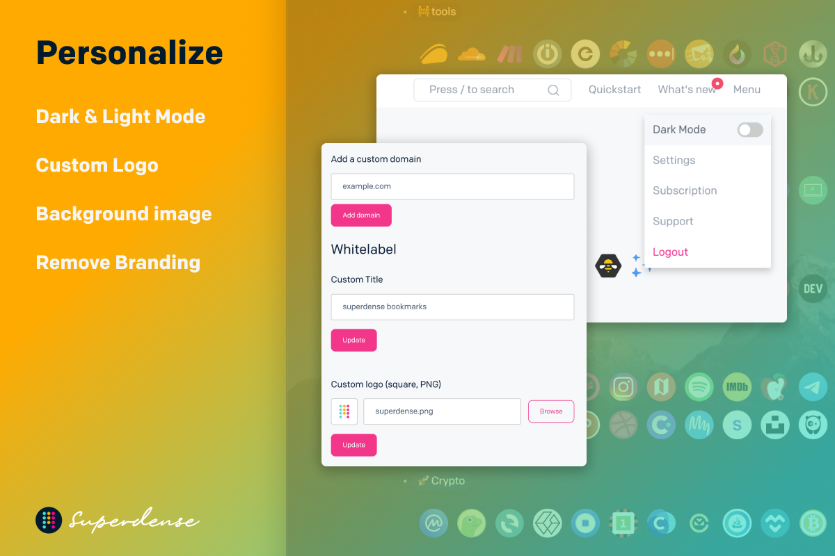
Personalize your Superdense homepage with new favicons, branded elements, and a custom domain.
This compact bookmark manager also lets you showcase your portfolio, favorite tools, and websites.
You can even share bookmarks on your public Superdense page, complete with a custom bio and domain.
Set categories to private and protect sensitive bookmarks like SaaS tools, dev accounts, client sites, and CMS portals.
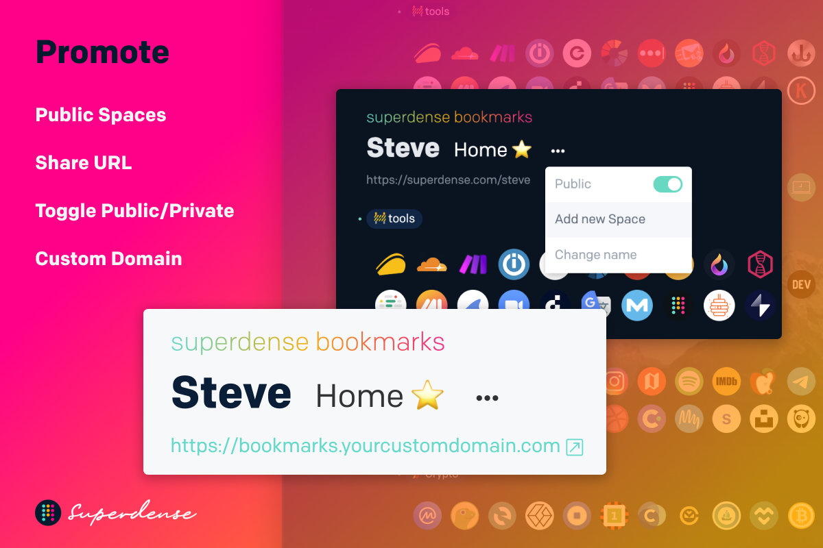
Share bookmarks on your public profile or set categories to private for more sensitive links.
Best of all, you can keep your whole team organized and in sync with individual pages for bookmarks.
All you have to do is invite team members via email, so they can sign up for their own Superdense account.
Superdense also lets you manage member access from one convenient dashboard, giving your team instant access to the links that fuel their best work.
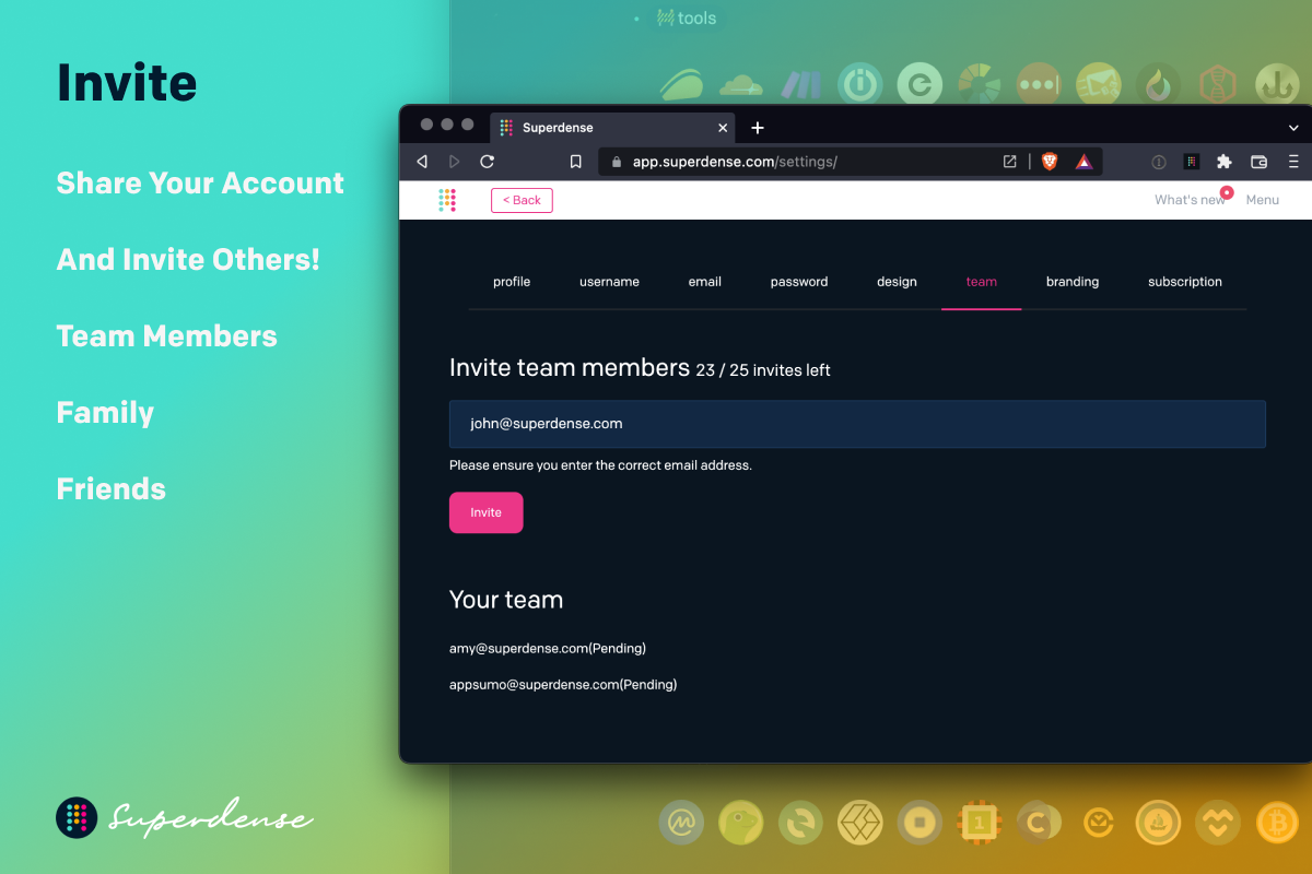
Invite team members via email to sign up for their own Superdense account.
Bookmark managers are supposed to be convenient, but they’re not always the easiest to navigate. ("Alright, fess up: which one of these 500 links is my portfolio?!")
Thankfully, Superdense keeps all your bookmarks organized in one place, so you can access everything across any browser or device in one click.
Keep tabs on your bookmarks.
Get lifetime access to Superdense today!
Plans & features
Deal terms & conditions
- Lifetime access to Superdense
- All future Company Plan updates
- No codes, no stacking—just choose the plan that’s right for you
- You must activate your license within 60 days of purchase
- Ability to upgrade or downgrade between 4 license tiers
- GDPR compliant
- Only for new Superdense users who do not have existing accounts
60 day money-back guarantee. Try it out for 2 months to make sure it's right for you!
Features included in all plans
- Unlimited bookmarks
- Unlimited categories
- Unlimited spaces
- Public and private categories
- Share spaces and categories
- Themes
- Public page bio