So, you’ve created this exceptional content and turned it into a great ebook. Now, you’re looking for how to craft a fantastic ebook landing page that will show the value of your ebook to your readers and convert them en masse.
Well, you’ve come to the right place. In this article, we’ll share the latest roundup of great ebook landing page examples you can leverage to design your own seamlessly. You’ll learn what’s unique about each, why it’s good, and the key takeaway you can emulate.
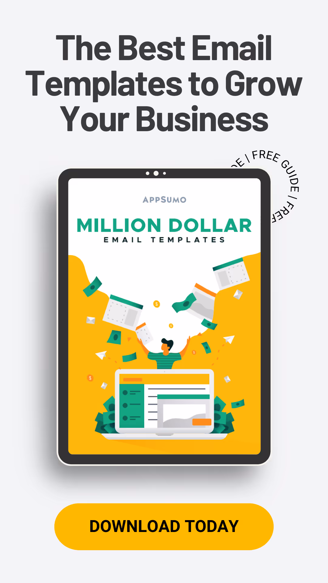
What is an ebook landing page?
An ebook homepage is the page that people from your audience go to in order to access, download or purchase your ebook.
The landing page copy is aimed at persuading readers of the unique selling point of the ebook.
The Headline tells what the ebook is about and the subheading helps readers visualize what the ebook can help them achieve.
The landing page features the image of the ebook, making it easy for the readers to also visualize what the document is about.
This paragraph gives readers some background on the “why” of this ebook.
Bullet points listing out what’s in the ebook and setting the reader’s expectations from the get-go. Notice how each of these bullet points makes a promise that anyone serious about email marketing cannot resist.
The function of an ebook landing page is to bring together persuasive elements that collectively help convert more visitors into leads.
Now that you know what an ebook landing page is, here are the essential elements that make a great ebook landing page.
What makes an effective ebook landing page
Before we jump into showing different examples of excellent ebook landing pages, let’s first discuss what makes a good landing page.
A strong headline
The headline is the first thing visitors will see when they land on your ebook page, so you need to make sure it’s up to par—enticing visitors to stay and scroll through the entire landing page.
How do you craft a solid landing page?
Be straightforward: It helps the reader have a clear idea of what’s in it for them. e.g., Free ebook: 15 Types of Emails Everyone Should Send
Tell the readers the main benefit of reading your ebook. e.g., Goodbye Writer’s Block, Hello Smart Copy
Stir your readers’ curiosity: This is essential to get your readers’ attention. e.g., Is Email Marketing Dead? Here’s What 15 Experts Had to Say
Eye-catching images
Using images on an ebook landing page helps to keep users’ attention and reduce bounce rates.
This is simply because we all respond to visual data and process it better than any other data type. Case in point: the human brain processes images 60,000 times faster than text.
Moreover, images can boost the conversion power of your ebook landing page. According to Social Media Today, companies that create custom visual content have a 7x higher conversion rate.
Here’s how to capitalize on images on your ebook landing page.
Illustrate some of the written words to make the information more digestible.
Create shareable visuals (make quotes and statistics visual).
Tailor each visual to the required image size of different social media platforms.
A short and simple lead generation form
Your target audience should not have to go through hurdles or many pages before putting their finger on the ebook. Doing so will hinder the user experience, and eventually drive down your engagement metrics.
The lead generation form should be straightforward—including only the necessary fields. Some marketers even argue that simply asking for their name and work email is just enough.
A single and clear CTA
An ebook landing page should also have a compelling call to action. You can place the CTA button multiple times on the page, but it’s recommended not to use CTAs with different outbound links.
According to ZoomInfo, landing pages with one link resulted in an average conversion rate of 13.5%, while pages with two to four links (with different outbound destinations) resulted in an average conversion of 11.9%. For five or more links, conversions drop even lower, to 10.5%.
Compelling copy
Your ebook landing page copy should have the sole goal of converting visitors. A common mistake most marketers make is limitingthe landing page copy to the description of the ebook.
Here’s what you should do instead:
Tell readers how the ebook will change their lives. e.g., this ebook will help you increase your conversion rates and pipeline.
Use social proof to convince readers to take action. e.g., this ebook has been downloaded by 150,000 marketers.
Make your text easy to read by using short sentences and paragraphs.
Now that you know what makes a great ebook landing page, here are a few examples of landing pages to take inspiration from.
10 ebook landing page examples that generate leads
Here are our top picks for the best ebook landing pages you can learn from.
1. Salesforce’s CRM Handbook
What’s unique about it: A one-pager beautifully designed with Salesforce’s brand colors.
Right from the headline, Salesforce lets you know what the ebook is about and goes on to show you how you can leverage the handbook to get results for your company. They’ve kept the copy minimal, with only two well-spaced-out subheadlines that bring the reader more focused on the practical advice they’ll get from the book.
Salesforce added a TrustArc trust badge that lets visitors know their information is secure and that they can trust the content inside the ebook.
It should also be noted that this ebook is primarily used as a lead magnet for C-level executives. That’s why the lead capture fields are geared towards getting more information about the company.
Salesforce can then leverage this information to easily segment leads.
Key takeaways: Keeping your ebook landing page short is an effective way to keep your readers focused on your core message.
2. 100 Days Of Growth by Sujan Patel & Rob Wormley
Sujan Patel & Rob Wormley are successful marketers who wrote an ebook together and created a unique landing page that helped them make over 10,000 sales in 6 months. So, of course, there are several things the duo had to nail down well.
First, the bold and uppercase used let them put an emphasis on the headline. Also, the one-liner explanation sentence gets the point across and adds to the purpose of the ebook.
They also kept the content minimal but added several persuasive components to hook readers and get them to take their desired action of buying the ebook. For example, the subheading (“PROVEN WAYS TO GROW YOUR BUSINESS FAST”) shows what readers will get from the ebook, then adds a preview button that allows them to glimpse the content behind the paywall.
They also added testimonials from top marketers to make the landing page content more relatable and drive action from the target audience. They used the same call to action twice and placed it both above and below the fold to maximize clicks.
Key takeaways: Especially if you’re trying to sell your ebook, it’s a great idea to let your readers enjoy a preview of the actual book before they can commit to buying it.
3. Taboola’s 5 Steps to Launch a Great Discovery Campaign
What’s unique about it: Very minimal copy, more visual content
The first thing you’ll notice about Taboola’s ebook landing page is its unique design. It’s a single-page landing page divided into three easy-to-navigate sections highlighted by colors.
They added the “Download” CTA button to each section and made them stand out from the background using a different color.
The few words in the three sections explain the book’s content and its importance to the reader. In the second section, instead of using a lot of copy, Taboola has simply listed the 5 chapters that make up the execution of a discovery campaign. This way, visitors get a taste of what to expect after downloading.
The third section calls out their target audience and the unique results that using the ebook can bring them.
Key takeaways: Simplicity also wins when it comes to ebook landing pages. You can cutthe many words and leverage a great design to hook your readers.
Optimizely’s ebook landing page has more words than the three above. Still, they’ve managed to keep the design simple with straightforward typography and a harmonious color scheme.
This ebook landing page invites visitors to drill down into the ebook’s content. The landing page is divided into two sections. On the left side is the written content, and it leaves ample room for the extensive lead capture form on the right side.
Combined, the three descriptive sections provide an overview of the ebook and create expectations for readers. In essence, they provide the audience with the information they need and allow them to decide whether or not they want to proceed with the download.
Key takeaways: Being thorough in your ebook description on the landing page helps target those genuinely interested in your ebook.
5. Foundr’s Idea to Brand ebook
What’s unique about it: Using social proof and Fear of Missing Out (FOMO) to convince visitors to download their ebooks.
The most striking part about this landing page is the use of video testimonials. This constitutes compelling social proof, and when people see many customers describing how the ebook helped them build their business from the ground up, they are more likely to be convinced.
The landing page exploits the fear of missing out (FOMO) at the end to create a sense of urgency and prompt action. They also provide a sneak peek inside the ebook by sharing a few strategies the reader will discover and the exact pages where they’ll find them.
Interestingly, there is no clickable link on the landing page other than the CTA button. They used the same CTA button 5 times on the ebook landing page.
Key takeaways: You can also leverage psychological triggers like FOMO and social proofs to elicit action from your target audience.
6. Impressa Solution’s Guide to Outsourcing Blog Posts
What’s unique about it: Highlighting the ebook’s value
First thing, this landing page asks rhetorical questions to agitate the target audience’s pain points and then tells how the ebook will help alleviate those pain. They used a larger font to draw the reader’s attention to the questions and give them reasons to read the text below.
The text shows the value of using the ebook by mentioning the benefits and what you can do with the ebook. Also, the lead capture form they used is pretty minimalist and only requires the essential information like name and email address.
Key takeaways: Sometimes all you need to convert your target audience is to paint a picture of their life with your asset and show them how it makes it easier for them. Highlight the value of your asset to the audience.
7. Impraise’s Guide To Remote Performance Management
What’s unique about it: A straightforward and beautiful design that is constant with the company’s brand.
The most beautiful ebook landing page on our list goes to Impraise. They used an attractive color scheme to present a beautiful interface to the readers. The colors are consistent with the company’s brand and complement the typography used. They made the short lead capture form stand out by using white to break up the pale background color and dark orange to highlight the unique CTA on the landing page.
The content is limited to a few words and a snappy headline to describe what the ebook is about. They also used bullet points to list the most important takeaways users will gain from the content. At the bottom of the page, they listed recognizable companies they have worked with to boost their credibility and trust.
Key takeaways: Great design is as important as great writing.
8. FreeAgent’s Guide to Freelancer Finances
What’s unique about it: It lets readers preview every chapter.
The featured image indicates a unique resource with concrete actions to help the target audience get better at what they do.
They used checkboxes to draw readers’ attention to the three main results they could enjoy by applying the book’s advice.
The text on the top fold is kept very short, and they used a bright green color to make the CTA stand out and draw attention to it. As an alternative to the short copy, they let the preview links do most of the talking. They describe the ebook chapters in a few words and provide a link that readers can use to get an instant preview of each chapter.
Key takeaways: One of the best ways you can get somebody excited about your ebook is to give them a clear idea of what to expect from it. Providing a preview lets you do that very well.
9. Transform’s 98 Hunger Control Shake Recipes ebook
What’s unique about it: A simple lead capture form.
The headline and the unique CTA clearly mention the free aspect of the ebook to the reader. The design is quite simple and does not use too many colors and it features an illustration of the book in question. The minimal lead capture form only asks for the visitor’s name and email address to download the document.
The landing page also provides an overview of the problems the book solves and focuses on the specific takeaways their target audience will love. The authors also showcased the publications they have appeared in and added an interesting “about us” note below with a picture to build trust and credibility.
Key takeaways: Depending on your target audience, asking them to complete too many fields before downloading the ebook can hurt your conversion rate. Consider sticking to the core information you’ll need from them.
10. Net Solutions’ Marketing Strategies
What’s unique about it: Highlighting their unique selling point (USP) to compel readers to download.
The Net Solutions landing page is one of the simplest and most well laid out. The headline clearly describes what the ebook is about, and there is almost no descriptive content in the top fold. This helps them, direct readers, directly to the section where they present their unique selling point.
They clearly state what they are offering the reader and emphasize that factor to attract and hook people to download the ebook. They also use statistics and research data to make their point and convince visitors of the ebook’s value.
Key takeaways: Find what makes you stand out from the competing companies and use it to your advantage. Igniting your USP helps the reader see the unique value you’re bringing to their table.
What you need to do next!
By now, you probably have tons of ebook landing page ideas rushing into your head, and you can’t just wait to get started. Great!
Bringing your vision into a beautiful and well-optimized ebook landing can be challenging. It can require a lot of design skills and, mostly, your time. That’s why you need to kick things off with tools that offer a library of ebook landing page templates and provide easy-to-use features to bring home your vision.
Here are a few tools you can use for this
Page Maker: You can use this tool to create unique ebook landing pages that make a great first impression and drive tons of conversions in minutes. It also allows you to edit and manage your engagement metrics, thanks to its built-in analytics tools. The most exciting part is that it requires no prior experience or coding skills; the user-friendly interface does most of the legwork.
Swipe Pages: This is a landing page builder that offers many templates that can inspire your ebook landing page. The interface is pretty intuitive, and the drag and drop feature makes creating a landing page a breeze. Here again, you don’t need to be a coding junkie to design a professional-quality ebook landing page.
Jeremy Moser
Founder and CEO of uSERP, an SEO growth firm for SaaS with over 50 team members. Forbes 30 Under 30 honoree.
The first impression is everything. Here we share 16 of the best homepages by some of the top online businesses and brands to help you create excellent experiences for every new visitor to your site.
You might think that user attention is attracted by stunning imagery or unique claims. And you’re not wrong. But the success of web design that converts largely depends on the way you position high-value elements on the page.
Wanna to make an effective one-pager? In this article, we'll explore the benefits and purpose of a one-pager. We’ll also show you several real examples.